QUItIndicators: Design considerations
(This is part II, for the introduction see part I)
The main points of this indicators exercise are to promote Qt5 QML+GLSL approach for building dynamic UI components (part I) and to give performance tips (part III, coming!). But here in the middle, we talk also a bit about design considerations behind these indicators. After all, who cares if your component performs well if it doesn't also look good and fulfil its functionality.
Here's set of design-related notes about QUItIndicators which we wanted to achieve:


These indicators are not highly original and will not win design awards. Graphics, effects and small details could be greatly refined. But we anyway tried to consider use-cases and apply them into the design. If you are eager to experiment yourself, grab the sources.
Next part will explain how to reach optimal performance to support these design considerations.
The main points of this indicators exercise are to promote Qt5 QML+GLSL approach for building dynamic UI components (part I) and to give performance tips (part III, coming!). But here in the middle, we talk also a bit about design considerations behind these indicators. After all, who cares if your component performs well if it doesn't also look good and fulfil its functionality.
Here's set of design-related notes about QUItIndicators which we wanted to achieve:
- The design language should be relatively neutral. Indicators like these may be used in many places, in applications and games, so they should not be too characteristic. And circles are pretty universal, so circles it is. The amount of circles in BusyIndicator is 11, by design. Reason behind this is that ProgressIndicator has one missing from top to mark start/end position, meaning 10 circles. This is optimal for percentages math e.g. when user sees 4 circles highlighted she can count that progress is at 40%. For smaller indicators, less & bigger circles might look better but decision was not to differentiate on these.
- Different use-cases call for different kind of indicators. When indicator is only visible briefly and progress can't be tracked, BusyIndicator is the one to use. Some events may take more time and then ProgressIndicator can be used to keep users better informed of how long they still need to wait. With longer taking tasks you could show percentages and make indicator even more dynamic to make it less boring for user to watch. Watching interesting animation makes 5 seconds to feel like 2... So from brief (left) to longer (right) waiting times, indicator to choose from our set would be:

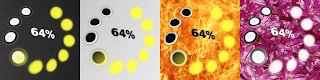
- Indicators should fit and be clearly visible on top of any background. Users may wish to place them on white, black or colorful areas and expects indicator to fit there. To achieve this, our indicators use neutral black&white as their base colors and contain inverted version which works better on light backgrounds. It's also possible to define alternative highlight color when the default yellowish isn't suitable. Here are few examples of ProgressIndicators on top of different backgrounds:

- Show/hide animations are also important. Too often animated items like these appear and disappear suddenly, breaking the illusion of a fluid component. In our component showing/hiding animations are combination of opacity, scale and vertex position skewing. Strips below show what the animation looks like. This could be made smoother but for performance reasons we use only vertex shader with a minimal mesh size. Fastly animated it anyway looks better than these still images.

- Sometimes indicators like these should attract user attention. When the application is blocked until loading is ready, it's good that user eyes focus on the indicator. Darkening (and blurring, Qt5 graphical effects make that easy) the rest of the UI is a good way to achieve this. But sometimes just the opposite is desired, directing user focus to real content and keeping indicators relatively obscure. Example of this is our Picture Wall demo, users attention is on loaded images instead of the ones still loading. With our indicators this can be achieved by decreasing opacity. (Developer note: When making your own ShaderEffect which rewrites the default fragmentShader, remember to multiply gl_FragColor with qt_Opacity to keep QML opacity property behaving correctly!). Here's how Picture Wall demo fades indicators into background:

- Circular zooming animation doesn't progress linearly, but instead follows a custom bezier curve. This change in speed makes animation feel more lively and natural as it would be affected by slight gravity, gaining speed when moving down and slowing down while reaching the top. Designs are often filled with small details like this, final touches.
These indicators are not highly original and will not win design awards. Graphics, effects and small details could be greatly refined. But we anyway tried to consider use-cases and apply them into the design. If you are eager to experiment yourself, grab the sources.
Next part will explain how to reach optimal performance to support these design considerations.
Comments